
Factsheet
Australia’s Age Structure

A population pyramid is a clear, visual way to demonstrate the age and sex structure of a population. This population pyramid of Australia’s current population shows:
What the pyramid tells us
The population is getting older
The pyramid’s shape looks more like a dome than a triangle, showing a mature, ageing population. The base is narrower than the middle, meaning Australians are having fewer babies.
Women outnumber men at older ages
This is a common feature of all population pyramids. Women tend to live longer, so the female side stretches higher near the top.
A bulge in the 30 to 50 age range
This reflects the large Generation X and Millennial cohorts. The bulge is also boosted by overseas migration.
Australia’s 2024 Population Pyramid
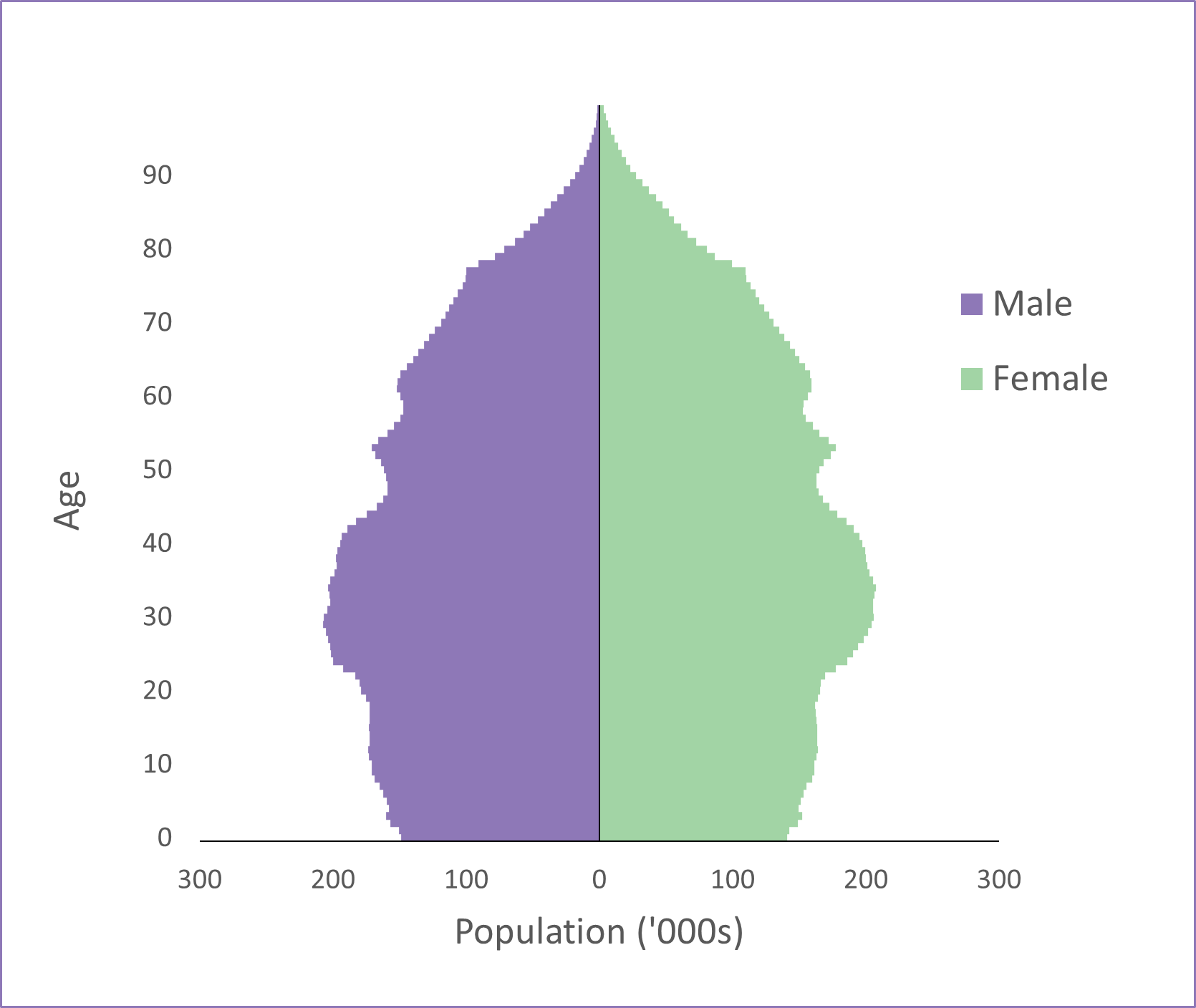
Figure based on ABS Population clock and pyramid data from 2024
References
- Australian Bureau of Statistics. (2026). Population clock and pyramid. ABS. https://www.abs.gov.au/statistics/people/population/population-clock-pyramid